In this blog, we explore the potential impact of Cloud Dancer, talk about one of our ranges that closely aligns with the tone, discuss how to get the most from white spaces and give you some practical design tips.


Materials that Resonate

Similar to the delicate variability of clouds, the graining of each alabaster piece is influenced by the natural forces that forged the stone over millennia. We select some of the purest white alabaster with a touch of grain, which perfectly embodies a cloud-like white with the movement of natural texture.
[P1-P1]

Cloud Dancer, a Design Shift?
The more we think about the selection of Cloud Dancer as Pantone's COTY, the more it may signal a not-so-subtle shift towards spaces with a more Scandi sensibility, one that favours calm neutrals and minimalism over bold colour and maximalism.
More and more in the modern age, we are bombarded by external forces that all make us feel more and more on edge, or uneasy. It's for this reason that the team at Pantone selected Cloud Dancer, as it is an invitation to pare back our palettes and consider what is truly important in our spaces.

Pantone director Leatrice Eiseman said so herself:
"At this time of transformation, when we are reimagining our future and our place in the world, PANTONE 11-4201 Cloud Dancer is a discrete white hue offering a promise of clarity. The cacophony that surrounds us has become overwhelming, making it harder to hear the voices of our inner selves. A conscious statement of simplification, Cloud Dancer enhances our focus, providing release from the distraction of external influences."
Leatrice Eiseman, Executive Director, Pantone Colour Institute

@home_with_candy_sky
Light and White
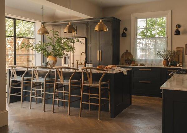
For interior design, white has always been a stalwart of interiors that desire brightness, openness or modernity, and how it's applied in a space alongside both natural and artificial light has a huge effect on how a space feels throughout the day as light shifts.
Often, the default ceiling colour is white, unless you're into colour drenching and you opt to blanket your space with colour, but we're all familiar with the impact that has; it feels cocooning, but can also make a space feel smaller. Is this COTY a signal that it's time to put down the colour-drenching paintbrush and return to the openness a white ceiling provides?
[SIDE-BY-SIDE]


[/SIDE-BY-SIDE]
@home.at.number.10 @allabout_thehome
Cloud dancer, however, isn't a pure white; it's more of a smoky, very light grey tone that, for interiors, could help to complement warmer-toned lighting and go very well with diffused window light to make spaces feel inviting rather than stark.
And for interiors in particular, an off-white can be an opportunity to make other elements in your space sing louder than they otherwise might. A brass wall light may get swallowed by a rich dark green, but a white wall reflects light onto the metal to highlight the details and craftsmanship that could otherwise be more subdued.

Tips for styling with Cloud Dancer
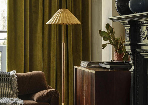
1. Let the palette breathe
Blend Cloud Dancer with a family of complementary hues through detailing, flooring and hardware. Warm light woods, rich metals and botanical touches provide a much-needed contrast while maintaining a refined, calming and minimalist space.
[SIDE-BY-SIDE]


[/SIDE-BY-SIDE]
@girlcominghome @amys_homelife
2. Use light to warm the space
Fixtures such as an alabaster pendant, a brass wall light or even natural window light, will cast a warm glow across the space, providing delicate changes to the way the colour appears in the space throughout the day and seasons.
3. Play with diffused shadows
In a space that employs a lot of white, shadows and areas of darkness can have more impact than normal. Allowing for some variance of brightness and a little dark to marry the light, will help bring a more dynamic nature to the space.

4. Texture is everything
5. Use curves to soften edges

@houstonhomewares
Do we think Cloud Dancer will revolutionise the interior design world? Probably not. However, it's a great opportunity to stand back and see where we can prioritise calm and serenity in our spaces, but without them feeling flat or boring. Rather than reinventing interiors, Cloud Dancer simply encourages us to edit with intention, letting texture, tone and considered design do the work that colour once carried.
[P2-P2]