Monochrome is so last year, with interior designers incorporating more and more colours into their work. Now is the time to jump on the bandwagon and add a splash of colour to your décor.
We’re seeing new trends every day, and it’s hard to keep up, however, colourful interior design trends are always in. We’ve come up with a round-up of the latest trends and tips on how to incorporate your favourite colours into them.
The Colour of Your Room Shows Your Personality, What’s Yours?
Interior design allows you to express your personality through your design choices. Colours are the first thing we see when walking into any room, therefore, picking the right colour scheme is one of the most important decisions to make when decorating.
Unsure of which colour scheme to go for?
Studies have shown we tend to pick colours that match our personalities. Colours are split into two tones, warm and cool, with both displaying different sets of personality traits.
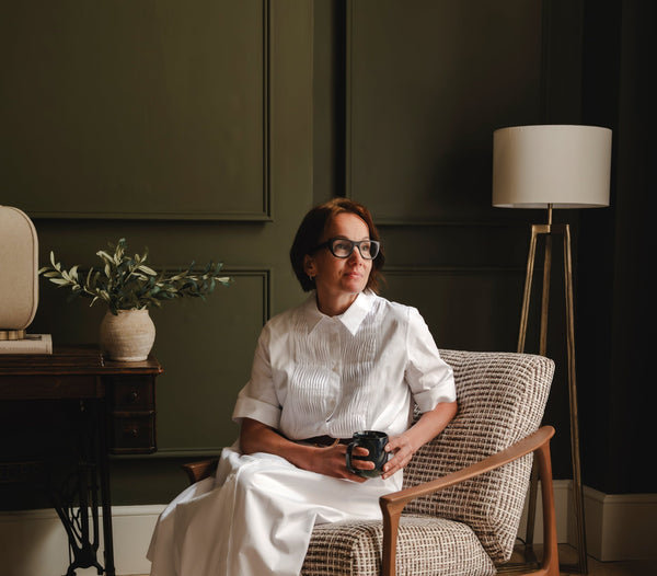
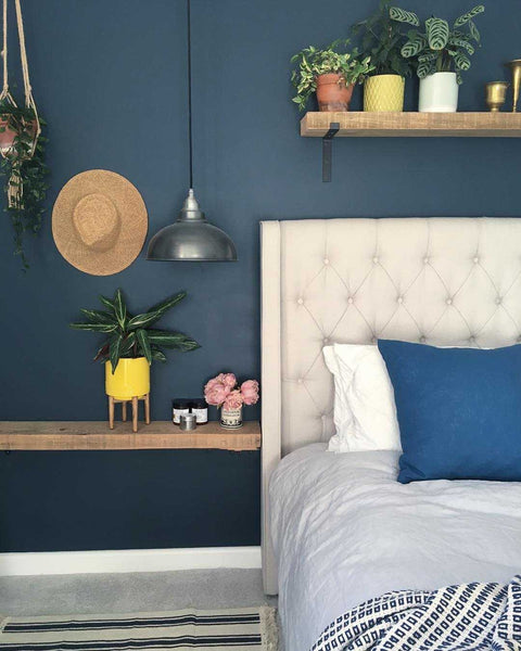
Brooklyn Dome Pendant – 13 Inch – Pewter, by Industville. (Image supplied by Amelia Wilson Interiors)
Warm Tones
If you prefer warm-toned colours such as orange, red and yellow, you tend to be more energetic, active and described as the ‘life and soul of the party’. People who favour orange tones in their home tend to be more sociable and enjoy inviting guests into their home, whereas people who prefer yellow, are often described as a ray of sunshine!
If you like yellow interiors, it’s said that you like to learn and share your knowledge with others. If red is your colour of choice you’re meant to be more passionate and like to live life to the fullest.
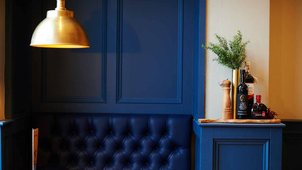
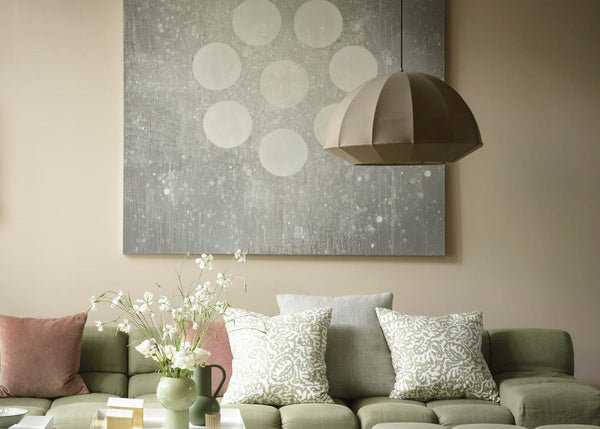
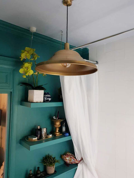
Brooklyn Dome Pendant – 13 Inch – Brass, by Industville. (Image supplied by Metamorphosis and Valentina Fine Foods)
Cool Tones
If you prefer cool-toned colours such as blue, purple and green, you tend to have a calmer nature, are more quiet and peaceful than people who favour warm tones. If blue is your colour of choice, you’re known as more reliable and enjoy keeping your house tidy.
If you prefer purple tones in your home, you tend to be more artistic and experimental. If you plaster your homes with lashings of green you tend to be more at one with nature, whether this be through coloured walls or a house full of plants.
Put Your Colour Stamp on Your Decor
Using colours in your interior design is key, but finding the colours that work for you is the most important thing to factor in. Incorporating too many colours could mean a recipe for disaster, as studies have shown that the colours that are around us affect our mood.
Each room should have different aesthesis as they’re for different purposes. Your bedroom should have a calming effect as it’s the room we use to wind down and get rest at the end of every day – adding too many colours would give our minds too much to process. The living room and kitchen are more energetic rooms, therefore incorporating brighter, and more out there colours are encouraged.
Not Brave Enough for a Colour Splash? Not to Worry
If bold colourful interiors are not for you, there are still a number of ways to incorporate colours into your home without going overboard. Our bespoke colour service allows us to match any given colour to what your heart desires. Whether you want your light to match your interiors or for it to stand out, we’ve got you covered!
Old Factory Pendant – 12 Inch – Pewter, Painting Service, £30 per unit, by Industville. (Image supplied by Project by Western Blueprint)
The Year of Ultra Violet
Pantone named ultraviolet as the colour of 2018, with it being described as powerful and bold. It’s time to embrace rich colours in your interior. Ultraviolet has been described as being the colour to “light the way, to what is yet to come” – let ultraviolet and our industrial style lights light up your décor!
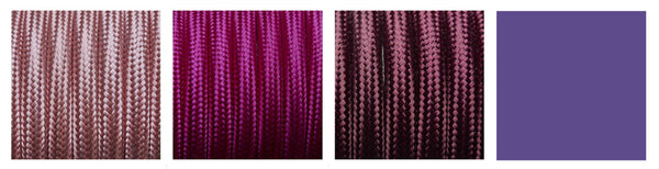
Pale Pink Round Fabric Flex – Braided Cloth Cable Lighting Wire, Magenta Round Fabric Flex – 3 Core Braided Cloth Cable Lighting Wire,and Plum Round Fabric Flex – 3 Core Braided Cloth Cable Lighting Wire, by Industville.
A colour as bright and vibrant as ultraviolet allows you to express your imagination, and when paired with metallic aesthetics, they are the perfect combination.
Add a Touch of Colour
With Fabric Flex
You don’t need to add a lot of colour – just a touch of colour can do any room a world of good. Our suspended lights all come with a coloured flex cable which is handcrafted and made to order. Here at Industville, we understand the need for consistency and therefore our fabric flex cables come in any colour you wish.
With Paintings
Another easy way to add a pop of colour without painting your walls is to integrate paintings into your home décor. Here at Industville, we like to support talented and aspiring artists, therefore we’ve devoted the walls of our showroom to show off some fabulous and unique pieces of art, which are the perfect way to add a splash of colour into your home without having to spend a fortune on redecorating.
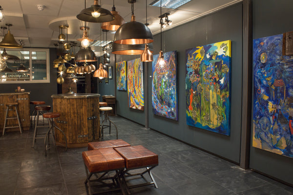
Our showroom showcasing our supporting artwork
Pewter and Brass Are a Match Made in Heaven
If splashes of bright colours aren’t for you, then the timeless duo, pewter and brass, can complement any given colour. Both metallic colours add an industrial edge to any interior. With industrialised décor always on-trend, pewter gives colours a rustic and shabby-chic feel, why not channel one of the trends we’ve mentioned alongside industrialised furnishings for a look that will never go out of fashion.
Old Factory Pendant – 12 Inch – Pewter, by Industville. (Image Supplied by @Scrumblesliving)
Paired with dark walls, brass brings a dramatic and empowering element to any given room. Pewter easily blends in with surrounding colours, whereas brass gives off a richer and more luxurious look. 2017 was the year rose gold took over, but interior designers have been favouring brass more this year, with the colour working particularly well with emerald green.
Sleek Giant Hat Pendant – 21 Inch – Brass, by Industville. (Image supplied by @Oliverthomasesq)
Get Jungle Fever
We’ve still got jungle fever and the forest vibes of this trend have evolved this year. Instead of incorporating bright, lively colours, it’s been about bringing nature into the home and taking full advantage of the refreshing green hues that are on offer.
Leaf prints are a perfect way to add a touch of nature into your interior, and match perfectly with brass and copper tones, especially if you’re like us and can’t keep a plant alive for longer than a week!
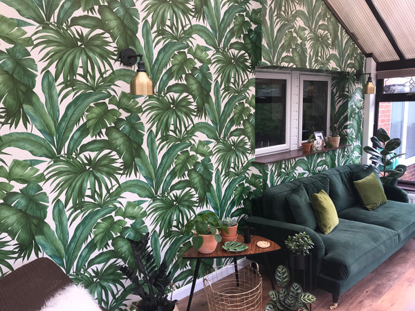
Brooklyn Cone Wall Light – 7 Inch – Brass, by Industville. (Image supplied by @happy_number_38)
Mix and match your favourite design trends to put your own stamp on your décor. Pairing tropical prints with industrial style lights allows you to modernise your interior while also having a vintage feel – the perfect tropical twist!
We hope this has given you some ideas on how to incorporate more colours into your home or business. We love seeing your pictures of our lights. Share them with us by tagging us on Instagram – @industville – or by using the hashtag #Industville. Got any questions? The friendly team here at Industville are more than happy to help. If you need any more inspiration, why not check out our Pinterest boards!